I’m in the process of evaluating various AJAX/DHTML frameworks for an enterprise application and one of the needs that deserved some hands-on experimentation was the ability create charts.
jQuery and YUI are in the lead as far as core frameworks for this application and the Google Visualization API seems pretty interesting so was included as well.
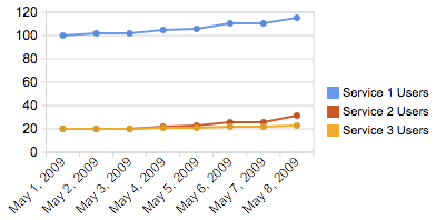
As a fairly simple and common use case I choose a target of a line chart that showed the number of users of a few services over time and defined some basic requirements:
- The data must be fetched from a separate URL, not defined on the presentation page (this URL will be a web service in production)
- Three series must be displayed at once
- The data points should have tooltips
- ‘Out-of-the-box’ components should be used when possible
- A non-flash solution is preferred
Some of the points I found interesting from each framework follow. Note that the charts here are only screenshots as I didn’t find any immediately obvious way to get the real charts working on wordpress.com.
Flot/jQuery

At this time it doesn’t seem that jQuery or jQuery UI has any built-in charting abilities but there are a ton of community plugins available.
Flot looked the most promising (Sparklines also looks very good for tiny charts).
Data
Flot seems to prefer its data in JSON format organized by series and we want to simulate a web service so we’ll create a file data/users-series-format.json containing something like:
[

{label: "Service 1 Users", data:[

...

[1241668800000,110],

[1241755200000,115]

]},

{label: "Service 2 Users", data:[

...

[1241668800000,22],

[1241755200000,23]

]},

{label: "Service 3 Users", data:[

...

[1241668800000,26],

[1241755200000,31]

]}

]
Presentation
Setup was simple enough. Include the scripts:
<!--[if IE]><script language="javascript" type="text/javascript" src="../excanvas.pack.js"></script><![endif]-->
<script language="javascript" type="text/javascript" src="scripts/jquery/jquery-1.3.2.js"></script>
<script language="javascript" type="text/javascript" src="scripts/jquery/jquery.flot.js"></script>
put in the placeholder where you want the chart:
<div id="placeholder" style="width:400px; height:200px;"></div>
get the data and build the chart:
<script id="source" language="javascript" type="text/javascript">
$.getJSON("data/users-series-format.json", function(json){
 $.plot($("#placeholder"), json, {
 xaxis: { mode: "time" },
 lines: { show: true },
 points: { show: true }
 });
});
</script>
Adding the tooltip was a little more complicated but not terribly so.
YUI

The Yahoo! User Interface Library (YUI) is a mature, robust library with Yahoo-supplied components for just about everything.
The YUI Charts Control (labeled as experimental at the time of this writing) creates nice looking charts, but they are flash-based.
There is plenty of documentation on YUI’s charts so I won’t go into too much detail but the concepts are similar to above.
Data
YUI’s DataSource component can handle several data formats, for consistency’s sake I went with JSON so my file data/users-raw-format.json (named so since it most closely resembles the raw data used to build it) contains:
{"Response" : { "Results" : [

...

{"date":"5/7/09","Service_1_Users":110},

{"date":"5/7/09","Service_2_Users":26},

{"date":"5/7/09","Service_3_Users":22},

{"date":"5/8/09","Service_1_Users":115},

{"date":"5/8/09","Service_2_Users":31},

{"date":"5/8/09","Service_3_Users":23}

]}}
I did have trouble getting this data to load properly via URL when the HTML file containing the DataSource code was loaded in the browser via file:// rather than http:// even after adding the file location to the Flash global security settings.
The chart also displayed oddly when the data contained JavaScript timestamps and a date parser was used, so as you can see a string date was used in the data, not ideal but this is just proof of concept.
Presentation
Include the scripts (YUI’s dependency configurator comes in handy here), add a place holder div for the chart, get the data, and build the chart.
Don’t forget to set YAHOO.widget.Chart.SWFURL to a location containing the swf.
Google Visualization API

There are some pretty slick examples in the Google’s Visualization Gallery like the Motion Chart, but for the purposes of our exploring we just need the Line Chart.
Once again we have a similar pattern for getting things running.
Data
Google requires that the web service providing the data source implement a particular protocol and format.
We’ll again use JSON and with Google’s format our data/users-google-format.json file looks like:
google.visualization.Query.setResponse({

version:'0.6',

reqId:'0',

status:'ok',

sig:'5982206968295329967',

table:{

cols:[

{id:'date',label:'Date',type:'date'},

{id:'s1',label:'Service 1 Users',type:'number'},

{id:'s2',label:'Service 2 Users',type:'number'},

{id:'s3',label:'Service 3 Users',type:'number'}],

rows:[

...

{c:[{v:new Date(2009,4,7,0,0,0)},{v:110},{v:26},{v:22}]},

{c:[{v:new Date(2009,4,8,0,0,0)},{v:115},{v:31},{v:23}]}

]

}

});
At first the format seemed cumbersome but I realize that many users would prefer this close resemblance to how the same data would appear in a spreadsheet.
Presentation
Loading of the scripts is a little different since you use Google’s core JavaScript API to load the charting tools needed and can call the chart initialization on successful load of that package:
<script type=“text/javascript” src=“http://www.google.com/jsapi”></script>
<script type=“text/javascript”>
google.load(“visualization”, “1”, {packages:[“linechart”]});
google.setOnLoadCallback(initialize);
where initialize loads the data:
function initialize() {
var query = new google.visualization.Query(‘data/users-google-format.json’);
query.send(handleQueryResponse);
}
and the query calls handleQueryResponse which draws the chart:
function handleQueryResponse(response) {
if (response.isError()) {
alert(‘Error in query: ‘ + response.getMessage() + ‘ ‘ + response.getDetailedMessage());
return;
}
var data = response.getDataTable();
var chart = new google.visualization.LineChart(document.getElementById(‘chart_div’));
chart.draw(data, {width: 400, height: 200, is3D: true});
}
</script>
Summary
Even with the extensive documentation and examples available on YUI I’d have to say it was the most difficult to deal with, presenting some little problem at almost every turn.
It didn’t seem that it would be very easy to use a JSON format other than the one recommended by the framework for any of the tools evaluated, which is disappointing.
There are certainly a lot of factors to consider before choosing a UI framework, but if all I needed were line charts I’d probably hand it to Flot/jQuery.


I want to express my admiration of your writing skill and ability to make reader to read the while thing to the end. I would like to read more of your blogs and to share my thoughts with you. I will be your frequent visitor, that’s for sure.
nice one and here in your 1st example ,have to add jquery.flot.time.js and also in users-series-format.json files’,lable and data have to be in “lable” and “data” (inside the double quote). unless its not work. thank you very much and I learned lot from this